
How this site came to be
Apple's “hello”, a navigation written as a sentence and a car driving back and forth between Cologne and Ulm. Here are the ideas behind this site and how they work under the hood.
Before a new Apple device shows you a single feature, it greets you. A “hello”, calm and unhurried, as if someone had been waiting just for you. I was twelve when I held my first iPhone, an iPhone 4, and ever since, that moment has been part of every new device for me. Few things have shaped the way I think about software as much.
At the start of 2026 I knew I wanted to build my own site, and I knew how it should feel: like that first moment. Clean, calm and thought through down to the last detail. Whoever lands on a portfolio wants to know who is behind it, and the site should tell exactly that within the first few seconds. That's why the first thing you saw here was a “hello” drawing itself stroke by stroke in Apple's handwriting.
In this post I'm taking you behind the scenes. I'll show you the ideas behind the different parts of the site, how they work under the hood and which details mattered most to me.
What I borrowed from Apple
The “hello” isn't a video or an image. It's an SVG line drawn with CSS. It ships ready-made in the HTML, so it starts on the very first frame without waiting for any JavaScript. Visitors reading in German see “hallo”, everyone else “hello”. Both come from Apple's own lettering and take exactly the same time to write, so everything that follows stays in step.
Besides the “hello”, I mostly borrowed the navigation. Apple doesn't hide things in nested menus, you simply find what you're looking for. So my navigation is a sentence: “I'd like to see your CV” or “I'd like to find out where you're based”. You click what you want to know, and a small hand-drawn loop shows you where you are.
Text that writes itself
The site is built on Next.js 16 with the App Router, TanStack Query handles everything that loads data, and next-intl takes care of the two languages. The most noticeable detail on almost every page, though, is the text that appears word by word.
It's a good example of how server and browser share the work here. The server renders the complete text as HTML, every word in its own element. Only in the browser does a Client Component take over and fade the words in one after another. For search engines, the text is complete from the very first byte, and anyone who has “reduce motion” turned on gets it without the animation. To make several paragraphs start cleanly one after another, and to show the calendar on the home page only once the text above it is done, a small zustand store keeps track of which stream has finished. That's also why each text only plays on your first visit. Next time, it's simply there.
A car between Cologne and Ulm
On the Locations page, I didn't want to just list two addresses. I grew up in Ulm and live in Cologne today, and that's exactly the route I wanted people to see. So a small car drives across the map there, from Cologne to my hometown and back again, for as long as you keep watching.
The map is rendered by MapLibre GL with vector tiles from CARTO, in a dark and a light style that switch with the site's theme. I had the route calculated once with the Open Source Routing Machine, 464 kilometers of highway and country roads. It had far too many bends for a calm line, so I reduced it to 29 points with the Douglas-Peucker algorithm and rounded it off again with Chaikin smoothing. The result lives in the code as a static list of coordinates, so the page never has to request a route at runtime.
The car itself is a small SVG sitting on the map as a marker. On every frame, the page works out where along the route it is and which way it's heading, and rotates it accordingly. It speeds up briefly, then drives at a steady pace and slows down before the destination, where it turns around. Behind it trails a soft glow, a gradient along the line that is also updated on every frame.
With “reduce motion” turned on, you only see the route, without the car. And since MapLibre is by far the largest library on the whole site, the map is loaded separately via next/dynamic as soon as you open the Locations page.
2,500 commits at a glance
On the home page, I wanted to show that things are actually being built here, and that's what the calendar is for. It combines my commits from several GitHub accounts and fetches them through GitHub's GraphQL API. That takes access tokens, and those have no business being in the browser. So the request runs on the server only, and the browser just gets dates and counts.
async function ContributionData({ children }) {
  "use cache";
  cacheLife("hours");
  cacheTag("github:contributions");

  const queryClient = makeQueryClient();
  await prefetchContributions(queryClient);
  // The data ships with the HTML, the browser doesn't have to ask
  return <HydrationBoundary state={dehydrate(queryClient)}>{children}</HydrationBoundary>;
}
To me, the "use cache" directive is the most important addition in Next.js 16. It turns a function or component into a cache entry whose key the compiler derives from its arguments. cacheLife("hours") makes the entry refresh in the background every hour, and cacheTag lets you invalidate it on demand. The result goes straight into the prerendered HTML and into TanStack Query's cache at the same time, so the calendar already has its data in the browser. The children, by the way, aren't part of the cache entry, they're just passed through. That keeps the calendar itself a perfectly normal Client Component.
When it appears, a wave runs diagonally through the weeks, and every tile fades into its shade with a slightly offset delay. That's more than 370 individual animations, and they stay smooth because only opacity and scale are animated.
A blog that is still static
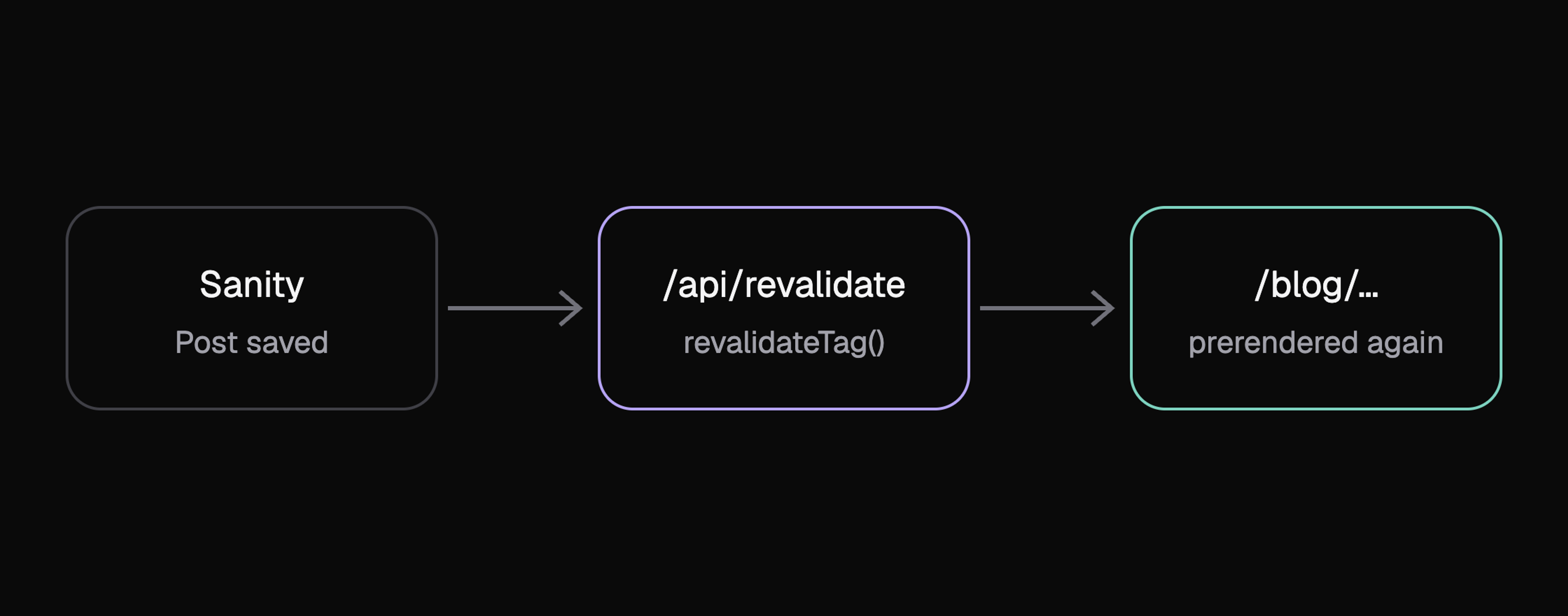
I write the posts here in Sanity, a headless CMS, and query them with GROQ. Still, every post is a static page, prerendered in both languages. Every query carries a cache tag. When I save a post, Sanity sends a signed webhook to the site, which verifies the signature and calls revalidateTag. That rebuilds exactly the pages showing this content, while everything else stays untouched in the cache.
Fast without you noticing
The nicest animation is worthless if the page takes a second to load first. That's why every page is prerendered, once in German and once in English, and served straight from Vercel's edge cache. Which language you get is decided by a small proxy before the request even reaches the cache. The address bar still just says /blog, without any language prefix.
This is made possible by Partial Prerendering, which builds on Cache Components in Next.js 16. Everything that can be computed ahead of time becomes a static shell, and only what truly depends on the individual request is streamed in behind a <Suspense> boundary. On this site, not a single such gap is left. Whatever can be cached on the server is cached, and whatever really belongs only to you, like the time in the footer or whether you chose light or dark, happens in your browser.
On top of that comes Partial Prefetching. As soon as a link enters the viewport, Next.js prefetches the shell of the target page, once per route rather than once per link. That's why a click in the navigation feels instant. For the cards on the blog I go one step further and prefetch the complete post as soon as the card becomes visible. All in all, the home page loads around 240 KB of JavaScript, and a good half of that is React, the Next.js router and Motion.
The little things
Whether a site feels good comes down to things you barely notice: how a word appears, how a photo reacts when you hover over it, how long a transition takes. I borrowed a lot of this from Emil Kowalski, who writes about animation like hardly anyone else.
Almost everything on my site moves along the same curve, cubic-bezier(0.23, 1, 0.32, 1), a much stronger ease-out than CSS's built-in curves. It starts fast and lands softly, and that's exactly what makes an interface feel responsive. See how different two motions with exactly the same duration feel.
The words in the streaming text use it to emerge from a slight blur instead of just popping in. The difference is small, but once you've seen it, you notice the hard pop everywhere.
I build fast, thoughtful web apps with Next.js and React, from the very first sketch to the finished product
/* Fast start, soft landing */
.stream-word {
  animation: stream-word 400ms cubic-bezier(0.23, 1, 0.32, 1) both;
}

@keyframes stream-word {
  from {
    opacity: 0;
    filter: blur(4px);
  }
}Everything you can touch with your mouse, like the polaroids on the about page, doesn't move over a fixed duration but as a spring with a stiffness of 320 and a damping of 24. You can tell the difference when you quickly hover over one and leave again: a spring can be interrupted mid-motion and simply turns around instead of playing its animation to the end first.

Almost everything animated is opacity and transform. The browser can composite both directly on the GPU without triggering layout or paint.
Just as important to me was where I deliberately left animation out. The “hello” only plays on the first load, the texts only appear word by word on your first visit, and the cards on the blog don't move on hover, because you pass over them all the time. If you've turned on “reduce motion” in your system, you get a simple fade almost everywhere.
Where the site is now
Today the site is what I imagined at the start of the year. It's fast, it tells you who I am, and it has the details that matter to me.
It's still not finished, though. This is the first post on the blog, and more will follow. If you have questions about the site or want to know more about any part of it, just write to me.